Key Concept: Averages, Range, and Standard Deviation, with A level Biology Past-Paper Questions
You need to know some maths for A level Biology. This includes knowing how to interpret averages (mean, median and mode), ranges, and standard deviations to work out whether an experiment can be said to have shown an effect or not. Master this early on and it will not help you with exam questions, but also make it easier for you to learn the bits of the course that are explained using these statistical methods.
Why does Biology need so much data?
Maybe the guy at the back is just big for his age?
Researchers often want to compare two or more things. Which species of frog is heavier? Which type of soil grows taller plants? At what temperature do these bacteria divide fastest? At which pH are fish most active?
The biological world is complicated, so multiple, repeated measurements are usually required.
There are three main reasons for taking multiple measurements:
Measurement errors. It’s hard to take measurements in the real world. Even if you re-measure the exact same thing, and even if you use a well-calibrated tool, you might get a slightly different result each time. Maybe you can’t hold the tool still enough, or you can’t read it clearly, or the thing you’re measuring moves. These are precision errors.
Individual variation. If you want to ask a general question about a whole population, eg “do robins sing more than blackbirds” then you need to measure data from more than two individuals. If you only use two, you might randomly pick outliers; maybe you get a particularly perky robin, or a lazy/sick blackbird. Similarly, if you sample a small area of a larger region, you may not pick a representative area.
Uncontrolled variables.There will nearly always be variable-influencing factors that you’re not aware of, or unable to control. Maybe there are changing sounds or smells in the environment, subtle changes in light, or in the birds’ blood-sugar levels. These can affect individual measurements in unpredictable ways.
All of these things can affect the value you record, making any one single measurement unreliable. So researchers normally end up collecting large sets of measurements. In this way they can get a much better idea of what’s really going on.
Why does Biology need Statistical techniques?
Plotting lots of repeated measurements for different datasets on the same graph can create a confusing mess. Also, “the data look different to me” isn’t good enough for science.
Reducing each dataset to just two or three values makes it much easier to compare. In fact, it’s so simple that such data can be understood even without a graph, so values are often presented very simply in a table.
Calculating Averages in Biology
There are three types of average: mean, median, and mode. They all reduce the data set to one single number.
This is useful for comparisons. For example, if you let a frog jump ten times, measuring the length of every jump, you can calculate their average jump length. You can then compare that single number to the average jump length from another frog to find out which jumps further.
Calculating the Mean
The most important type of average for A level Biology is the mean. It’s also what most people are talking about when they say “average” in everyday life.
To find the mean, add up all the numbers, then divide by how many numbers there were. You end up with just one number.
Here’s an example dataset:
| Set 1 |   | 3 | 4 | 5 | 5 | 5 | 6 | 6 | 6 | 7 | 8 |   | total = 55   /   n = 10   /   mean = 5.5 |
| Set 1 |   | 3 | 4 | 5 | 5 | 5 | 6 | 6 | 6 | 7 | 48 |   | total = 95   /   n = 10   /   mean = 9.5 |
| Set 1 |   | 3 | 4 | 5 | 5 | 5 | 6 | 6 | 6 | 7 | 48 |   | central number(s) = 5 and 6   /   median = 5.5 |
| Set 1 |   | 1 | 3 | 5 | 5 | 5 | 5 | 6 | 6 | 7 | 48 |   | mode = 5 |
| Set 1 |   | 50 | 50 | 50 | 50 | 50 | 50 | 50 | 50 | 50 | 50 |   | mean = 50   /   median = 50   /   mode = 50 |
| Set 2 |   | 25 | 30 | 35 | 40 | 50 | 50 | 60 | 65 | 70 | 75 |   | mean = 50   /   median = 50   /   mode = 50 |
| Set 3 |   | 1 | 2 | 3 | 4 | 50 | 50 | 96 | 97 | 98 | 99 |   | mean = 50   /   median = 50   /   mode = 50 |
The averages are the same! By themselves, averages only tell you one small part of the story.
What is Range / why is it useful
One of the big differences betwen the datasets above is the range of numbers that appear.
The range is the range-of-values that appear, from the lowest to the highest.
| Set 1 |   | 50 | 50 | 50 | 50 | 50 | 50 | 50 | 50 | 50 | 50 |   | lowest value = 50   /   highest value = 50   /   range = 50 to 50 |
| Set 2 |   | 25 | 30 | 35 | 40 | 45 | 55 | 60 | 65 | 70 | 75 |   | lowest value = 25   /   highest value = 75   /   range = 25 to 75 |
| Set 3 |   | 1 | 2 | 3 | 4 | 50 | 50 | 96 | 97 | 98 | 99 |   | lowest value = 1   /   highest value = 99   /   range = 1 to 99 |
Set 1 has a range of 50 to 50. So you can reasonably predict that the next measurement would likely be 50 too
Set 2 and Set 3 have wider ranges. There are a wider range of possible values that might be measured, so it’s harder to predict what the next measurement might be.
A wide range might indicate that your measurement technique is very unprecise, or that there is a wide natural variation in the thing you are measuring, or that there is another factor affecting your measurements.
But a wide range might also just mean there were one and two weird outliers in the data. So you need to be careful when using this value. Here is a set with one odd measurement, which might be due to a measurement error.
| Set 4 |   | 50 | 50 | 50 | 50 | 50 | 50 | 50 | 50 | 50 | 90 |   | lowest value = 50   /   highest value = 90   /   range = 50 to 90 |
| Set 1 |   | 25 | 42 | 48 | 50 | 50 | 50 | 50 | 52 | 58 | 75 |   | values clustered around mean = low standard deviation |
| Set 2 |   | 25 | 30 | 35 | 40 | 45 | 55 | 60 | 65 | 70 | 75 |   | values spread out away from mean = high standard deviation |
To understand Standard Deviation, think about a situation where you have made very many measurements, so that you have multiple measurements at each possible value. Now plot these on a graph (see below). In biology, you usually see that the graph forms a bell shape. This is called a “Normal distribution”.
Normal distributions are symmetrical, so the mean, mode, and median are all the same, appearing at the centre of the graph (mean, median, and mode = 16 in this example). In normal distributions, most measurements are near the average, so there is a peak in the middle of the graph.
(Sometimes, you’ll find a curve is skewed a bit to one side. This separates out the mode, median and mean values. But for our purposes, I’m going to stick to thinking about the symmetrical graph.)
How wide the curve is matters a lot, because it affects how much two sets of data overlap. Compare these two examples below. Both have one set of data where the mean is 14 (plotted in orange), and another set where the mean is 20 (plotted in blue).
There is the same amount of data in both graphs, and the averages haven’t changed. But there is a lot less overlap between the two datasets in the example to the left. The data on the right is a lot more spread out away from the average values.
When datasets overlap a lot, you need to be very careful that you definitely have enough data to be sure their means really are different. If you have a small data set with a lot of variation, then adding extra measurements can make a big difference to the mean.
What is Standard Deviation
Standard Deviation tells you how widely the data is spread out in a normal distribution. Its symbol is sigma, “σ”.
You’re very unlikely to be asked to calculate standard deviation in an exam, and it takes a while to explain so I’m not going to go through it here (don’t worry they’d give you the equation if you did have to do this).
But you do need to know what it tells you.
Here is the basic normal distribution graph again. The graph is symmetrical and the mean (μ) is in the centre.
Now here is the same graph, but two more values are marked on the x-axis, shown by orange lines. These are the value of the mean minus one standard deviation (μ-σ), and the value of the mean plus one standard deviation (μ+σ).
If you colour in the bit of the graph that is within one standard deviation of the mean (from μ-σ to μ+σ), then on any normal distribution, 68.27% of the data points will lie within this area. You don’t need to remember that percentage, but remember it is always the same.
This means that if the standard deviation is a small number, you know most of the data points are close to the mean. This gives you more confidence that the mean is a useful value for comparison.
The graphs below have the same X-axis. Both are normal distributions with the same mean. But the one on the left has a small standard deviation, and the one on the right has a high standard deviation. (Some of the data from the right-hand graph falls outside the values shown on the graph.)
How to tell if there is a significant difference between values using the mean and standard deviation
!! Ok so this is the important bit we’ve been building up to !!
In a normal distribution, most of the data (68.27%) falls within one standard deviation of the mean. This is the area between μ-σ and μ+σ.
To work out whether it’s just chance that the means are different, or whether it’s a real effect, you need to check whether this area overlaps bewteen the two sets of data.
If the areas between μ-σ and μ+σ overlap, the difference is not considered significant.
There are different ways of presenting the data.
Standard Deviations Using Numbers - example
An example:
Set 1: mean (μ) = 50, standard deviation (σ) = 8
Set 2: mean (μ) = 40, standard deviation (σ) = 3
Are these sets of data significantly different? Look at the areas between μ-σ and μ+σ
Set 1: μ-σ = 42 and μ+σ = 58
Set 2: μ-σ = 37 and μ+σ = 43
Do these areas overlap? Yes they do (both include 42-43). So you can not consider the two data sets significantly different.
(Also worth knowing: nearly all the data (95.45%) falls within two standard deviations (between μ-2σ and μ+2σ) - so if these two areas don’t overlap you can be even more sure the two sets of data really are different.)
Standard Deviations Plotted on Graphs - example
On graphs, the mean is plotted as usual, with a dot or column. Extra lines extend out to show the area from μ-σ to μ+σ. This can make it more obvious whether areas overlap or not (unless they are super close in which case numbers are more useful).
Standard Deviation Exam Past Papers
Example Exam Question 5
Question 5 answers found at the bottom of this web page
Understanding Standard Deviations from Graphs
Example Exam Question 6
Question 6 answers found at the bottom of this web page
Example Exam Question 7
Question 7 answers found at the bottom of this web page
Graphs and Tables in A level Biology
If you’re not confident with questions that include graphs and tables, see the recent blog post “How to Approach A level Biology Graph and Table Questions: Tips and Exam Question Pack”, which offers more useful tips for navigating them during exams, and more exam questions to practice with.
Answers to example exam questions
The data for the damaged block should be ignored. The mean for shape C is 3520 seconds
Cinnamon Oil median = 16, mean = 17 ….. and ….. Postive Control median = 12, median = 13
Median = 41. This avoids the outliers affecting the value as would happen if you used the mean. And the sample size is too small to use the mode (there are no repeated values)
The range is 2 to 11
Bull terrier genetic diversity is significantly the smallest of the breeds shown, meaning it the most inbred. Jack Russell genetic diversity is significantly the greatest. The genetic diversity of Miniature terrier and Airedale terriers are similar with no significant difference between the two.
Standard deviation is spread of data around the mean; using standard deviation reduces effect of anomalies/ outliers; standard deviationcan be used to determine if (the difference in results is) significant/not significant/due to chance /not due to chance
Trapping increases enzyme/GOx/HRP activity; the difference/increase is significant (it is unlikely to be due to chance as the standard deviations do not overlap)
Key Concept: Surface Area to Volume ratio (SA:V)
Some concepts turn up again and again in A-level biology. Taking a little time to ensure you really understand these key concepts from the start can save a lot of effort overall.
Surface area to volume ratio (SA:V) is vital for understanding a wide range of topics including transport across cell membranes, gas exchange, digestion, heat exchange, and mass transport. SA:V explains why the inner membrane of a mitochondrion is folded, why elephants have big ears, and why jellyfish don’t need blood vessels.
Some concepts turn up again and again in A-level biology. Taking a little time to ensure you really understand these key concepts from the start can save a lot of effort overall.
Surface area to volume ratio (SA:V) is vital for understanding a wide range of topics including transport across cell membranes, gas exchange, digestion, heat exchange, and mass transport. SA:V explains why the inner membrane of a mitochondrion is folded, why elephants have big ears, and why jellyfish don’t need blood vessels.
How confident are you in calculating this value and understanding its significance?
What are surface-area-to-volume ratios?
"Microvilli-Duodenum" by Wbensmith is licensed under CC BY-SA 3.0.
The ratio tells you about how changing the shape or volume of something affects its surface area. It’s not as simple as many people think: doubling the volume of ice-cream in a choc-ice doesn’t double the area of chocolate needed to cover it.
Surface areas are really important in biology. And so the shapes and volumes of things including organelles, cells, and organs are often optimised with respect to surface area. Whenever you see a weirdly folded or worm-shaped structure, think about SA:V.
Surface area to volume ratio (SA:V) is a value calculated by dividing a thing’s surface area by its volume. It is a single number that tells you about the relationship between the two input values.
To be precise: SA:V tells you how much surface area there is per unit of volume.
How to calculate SA:V (it’s not difficult, you just divide)
Quick maths refresher
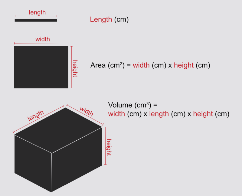
You will need to think about length, area, and volume and understand their units. Here’s a reminder for cuboids:
Simple example
Imagine a cube where every edge is 1 cm long. (Note: this blog doesn’t let me write little superscript numbers so I’ll use ^ to indicate that the following number should be written superscript, so 1^2 would mean 1-squared.)
Each square face of the cube has a surface area of 1 cm x 1 cm = 1 cm^2
Cubes have six faces, so the total surface area is 6 x 1 cm^2 = 6 cm^2
The volume of the cube is 1 cm x 1 cm x 1 cm = 1 cm^3
SA:V = surface area / volume. In this example that’s 6 cm^2 / 1 cm^3 = 6 cm^-1
Notice the funny unit there. You’ve divided cm^2 by cm^3 so they don’t cancel out perfectly.
But does it matter what this unit is? Let’s try it using the same cube but measuring it in millimetres.
Each square face of the 1 cm cube has a surface area of 10 mm x 10 mm = 100 mm^2
Cubes have six faces, so the total surface area is 6 x 100 mm^2 = 600 mm^2
The volume of the cube is 10 mm x 10 mm x 10 mm = 1000 mm^3
SA:V = surface area / volume. Using millimetres that’s 600 mm^2 / 1000 mm^3 = 0.6 mm^-1
1 mm is 1/10 of 1 cm and the SA:V calculated in mm is 1/10 that of the value calculated in cm. If you are comparing SA:V values, make sure they have the same unit.
Of course you don’t find a lot of cubes in nature. In exams they might simplify cells or other bodies to be imagined as spheres of a known radius, and give you equations for you to calculate the surface area and volume. And there are much weirder shapes to think about too. But before we get to all that …
How does SA:V change as things increase in scale?
We know the 1 cm cube has a SA:V of 6 cm^-1.
So, what if we get a handful of these 1 cm cubes and stick them together to make a scaled-up cube where every edge is 2 cm long? (See picture). How will the SA:V of this new structure compare? It’s still a cube, after all; it’s just a bit bigger.
2-cm cube:
Each square face of the assembled cube has a surface area of 2 cm x 2 cm = 4 cm^2
Cubes have six faces, so the total surface area is 6 x 4 cm^2 = 24 cm^2
The volume of the assembled cube is 2 cm x 2 cm x 2 cm = 8 cm^3
SA:V = surface area / volume. In this example that’s 24 cm^2 / 8 cm^3 = 3 cm^-1
The larger cube’s SA:V is only half that of the unit cube!
SA:V is surface area divided by volume. Higher values of SA:V mean there is more surface area for each unit of volume, and lower values of SA:V mean there is less surface area for each unit of volume.
So our 2 cm cube has less surface area per unit volume than the 1 cm cube did.
The larger cube has a lower SA:V. And if you work out the numbers for an even bigger one, you’ll get an even lower SA:V.
This makes sense. To build the 2 cm cube, you stack eight 1 cm cubes together. By doing this, you bury some of their faces within the structure. You end up with the same volume as eight individual 1-cm cubes, but you have reduced the surface area that is exposed to the outside world.
Also, if you look carefully at the picture, you’ll see that each cube in the assembled structure has half of its faces buried. So there’s only half the surface area per unit volume compared to the single cube. And so it makes sense that the SA:V is half what it was for the single cube.
Each small cube is only showing three of its six faces. So for each 1 cm^3 volume (ie for each small cube) there is 3 cm^2 surface area exposed, giving us an overall SA:V of 3 cm^-1.
Key concept: as size increases, SA:V decreases. This is a good thing to explicitly state in any question about SA:V and size, where the shape stays the same.
Try it: calculate SA:V for a 3 cm x 3 cm cube. What value do you guess you might get? And what is the actual value?
Why size matters
"Zygote" by Nina Sesina is licensed under CC BY-SA 4.0.
Imagine you are a single cell (well, you were once, don’t you remember?).
Your cell membrane is your connection with the outside world. Through it you take in nutrients, water and other necessary things. And you expel your waste through it.
This membrane is your surface; you have as much surface area as you have cell membrane.
Meanwhile, inside the cell membrane you have cytoplasm, organelles, etc. In this region you are busily metabolising molecules. You can measure this region as your volume.
Question: can you take in enough nutrients, and expel enough waste, to keep up with your metabolism?
More-important question: if you grow bigger, will this still be true?
Valonia ventricosa aka Sailors eyeball - a single cell that can grow up to 5 cm in diameter. But … how???
As a cell grows larger its SA:V falls. This is just like we saw with scaling up the cubes above. The growth of the cell’s surface area (cell membrane) just can’t keep up with the growth of its volume (where the metabolism is). This means there will be a point at which there just isn’t enough cell membrane (surface area) to transport everything that needs to be transported, limiting the cells ability to function.
This is one reason why cells tend to be pretty small!
But … wait a minute, what about the freakish cell in this next photo? A shiny, bright green, single-celled alga that can get up to 5 cm in diameter. A single cell! Charmingly known as ‘sailors’ eyeballs’.
But how can one cell possibly be so large? Isn’t its SA:V ridiculously low? (Spoiler: yes it is). How can it transport everything it needs with such a low SA:V? Well, it has a trick …
Shape matters
This giant cell is cheating. Inside, all the metabolic activity is limited to an area very close to its cell membrane. Nearly all of the cell’s interior is filled up by one giant vacuole that pushes all the interesting stuff out to the region next to the membrane. So there isn’t nearly as much metabolism going on in there as you might imagine from its total volume. If you re-calculated its SA:V ignoring the volume inside its vacuole, you’d get a much more sensible number. (It also has multiple nuclei spread throughout its cytoplasm.)
In exams, questions are usually about solid spheres or cuboids. We’ve looked at cuboids, so let’s look at spheres.
Spheres
If you have to calculate for spheres, they will give you the equations you need to calculate volume and surface area. So don’t worry about remembering these.
Volume of a sphere = 4/3 x π x r^3
Surface area of a sphere = 4 x π x r^2
So, if you have a sphere of radius 1 cm (remember this is just the distance from the centre to the outside, so the whole thing is 2 cm across):
The surface area is 4 x π x r^2. If r = 1, r^2 = 1. So the surface area is 4 x 3.14 x 1 = 12.6 cm^2
The volume is 4/3 x π x r^3. If r = 1, r^3 = 1. So the volume is 4/3 x 3.14 x 1 = 4.19 cm^3
SA:V = surface area / volume. In this example that’s 12.6 cm^2 / 4.19 cm^3 = 3 cm^-1
This is the same SA:V as the 2-cm cube!
That important phrase “as size increases, SA:V decreases”, is talking about increasing the size of something while keeping the same shape overall. Shape is also really important!
Spheres have the lowest possible surface area for their volume. This is one of the reasons that nature likes them. For example, bubbles are spheres because surface tension pulls their surface in to minimise its area.
Stretching out
If a cell needs to grow to large dimensions but also needs to keep a high SA:V, it needs to avoid being a sphere. More-complex shapes will always have higher SA:V.
Consider neurons. You have a single neuron that reaches from your big toe to your spine. A single cell over a metre long! But these neurons are definitely not spheres. They are very skinny.
Question: what happens to SA:V when you make long/thin shapes?
Let’s go back to the 1 cm cubes. The 1 cm cube had a SA:V of 6. And the 2 cm cube had a SA:V of 3.
The 2 cm cube had a volume of 8 cm^3 : it was made out of eight small cubes. Let’s take those eight small cubes and rearrange them into the shape of a flatworm: a rectangular block of 2 cm x 4 cm x 1 cm (see picture above).
The upper and lower faces of this shape each have a surface area of 8 cm^2
The two long sides of this shape each have a surface area of 4 cm^2
The two ends of this shape each have a surface area of 2 cm^2
The total surface area is (2 x 8 cm^2) + (2 x 4 cm^2) + (2 x 2 cm^2) = 28 cm^2 (the 2 cm cube had 24 cm^2)
The volume of the assembled cube is 2 cm x 4 cm x 1 cm = 8 cm^3 (ok that isn’t a surprise)
SA:V = surface area / volume. In this example that’s 28 cm^2 / 8 cm^3 = 3.5 cm^-1 (the 2 cm cube was 3 cm^-1)
Rearranging it from a 2 cm cube to a flatworm of the same volume has increased its SA:V.
Ok so let’s push it even further and turn it into a long worm.
The upper and lower faces of this shape each have a surface area of 8 cm^2
The two long sides of this shape each have a surface area of 8 cm^2
The two ends of this shape each have a surface area of 1 cm^2
The total surface area is (2 x 8 cm^2) + (2 x 8 cm^2) + (2 x 1 cm^2) = 34 cm^2
The volume of the assembled cube is 1 cm x 8 cm x 1 cm = 8 cm^3 (no surprise)
SA:V = surface area / volume. In this example that’s 28 cm^2 / 8 cm^3 = 4.25 cm^-1 (the 2 cm cube was 3 cm^-1)
Your neurons can be really, really long because they’re also skinny, because that means they still have a really high SA:V.
And of course this works for whole animals too. Many small animals lack blood vessels and rely on molecules simply diffusing through their bodies. They need high surface area for transport and they also need every part of their interior to be not-to-far from that surface. This is (one of) the reasons we don’t have truly-giant insects: they are limited by their ability fo transport things to/from the outside world. Sponges and jellyfish also lack blood vessels and rely on diffusion.
Nemotode by Bob Goldstein, UNC Chapel Hill http://bio.unc.edu/people/faculty/goldstein/ Licenced under a Creative Commons Attribution-Share Alike 3.0 Unported licene
Tardigrade by Alexander Klepnev licenced under CC BY-SA 4.0.
Humans, alongside other larger animals, have much lower SA:V and suffer from low diffusion rates. So we need specialised structures to aid exchange and transport.
Maximising SA:V
Structures that are involved in transport and exchange rely upon having very high surface areas of membrane across which transport can take place. To maximise exposed surface area, structures are folded, or shaped into fingers, or branches.
In the human body, you find extremely high SA:V ratio in specialised structures including:
Gut - the gut wall has microvilli, finger-like structures that extend into the lumen. These increase surface area for absorption of water and nutrients
Lungs - the lungs have many branches terminating in tiny alveoli offering a very high surface area for gas exchange.
Capillaries - capillaries have much higher SA:V than arteries or veins. This offers a higher surface area for transporting things between the blood and tissue fluids. It also increases fluid resistance, which is important to keep the blood moving forward.
Red blood cells have a biconcave shape that increases their SA:V allowing better gas exchange with the blood plasma.
In other organisms, the shapes of structures like leaves, chloroplasts, gills, root hairs, and fungal hyphae, among many other examples, are similarly optimised to maximise surface area to volume ratios.
Folded membranes
You also find folded membranes used as a way to squeeze a load of membrane into a small space. Eg:
Mitochondria have a highly folded inner membrane that offers more surface area to embed the enzymes and proteins involved in oxidative phosphorylation, so that more ATP can be produced.
Golgi apparatus and endoplasmic reticulum are similarly folded to maximise their surface area.
Thermoregulation
Who is is feeling cold, and who is feeling hot?
Body surfaces also exchange heat with the environment.
We naturally change our SA:V when we get hot or cold by changing the position of our limbs and body. Which of the people in the image has the highest SA:V? Which person is feeling cold, and which is feeling hot?
Dogs increase their surface area by opening their mouths when hot and panting (passing air over their wet surfaces to lose heat through evaporation). Cats form neat loafs when cold but sprawl dramatically across the floor when hot.
Organisms’ entire body shape will also be related to their thermoregulatory needs.
Animals that need to lose heat from their bodies usually have a higher SA:V, and animals that need to conserve heat usually have a lower SA:V. This is why elephants have such huge ears (more surface area from which to lose heat) and why animals from cold environments tend to be more spherical than those from hot climates.
"Emperor Penguins" by Christopher.Michel is licensed under CC BY 2.0.
"Black Necked Stork" by AntoGros is licensed under CC BY 2.0.
Keep it in mind
If you can get an intuitive feeling for Surface Area to Volume ratios, and keep them in mind whenever you see a question about folded structures, or about similar shapes of different sizes, then this will help you understand what questions are really asking. A level Biology is about the why and how much more than it is about remembering facts, and SA:V goes a long way to help you understand things on this deeper level.
This article was written by Dr Jenny Shipway with guidance from Tom Whitburn
How to approach and answer AQA A-level Biology Questions that need you to interpret Graphs- lots of AQA past paper questions
How to approach and answer A-level Biology Questions that need you to Analyse Figures, Tables and Images - lots of example past paper questions with the markschemes
Magical top tip: DO NOT LOOK at the question first - LOOK at the data first
This simple trick can transform how easily you will be able to answer graph questions
ALWAYS LOOK AT THE DATA FIRST
Look closely at the graph or table
Graphs - look very carefully at the axes - have they plotted rate or time, mass/volume or concentration ? Often students assume enzyme graphs have rate on the y axis - sometimes they don’t !
Table - is the IV in the first column ? What are the units of the DV ? Has a mean been calculated ? Is the data in each row consistent ?
are there range/SD bars on the graph ? remember this indicates the variation in the data that was used to calculate the mean
do the range bars or standard deviation bars overlap ?,
If the Standard deviations (+or- 2 SD overlap then the DIFFERENCE between the MEANS is due to chance - the differnce between the means is not statistically significant).
In a table what range is in the replicates when you compare to the mean ?
what trends can you observe ?
then think about what principle of biology is being shown by the the trends, for instance - enzymes and substrate concentration or mitosis and distance from the root tip
How would you explain the highest value, the lowest value, the point at which the line crosses the x axis, how would you explain the largest range, how would you change the method to reduce the spread in the data ?
Have a look at these 20 excellent recent graph interpretation AQA Questions
An old collection of OCR maths-heavy questions for extra practice
Y12 and Y13 AQA small group weekly class information
Calculations - Mathematical Content in A level Biology ..... Some easy some not so easy from AQA Biology
10% of the marks in Biology papers are for calculations. Here are some good practise questions and a great advice document from OCR (applicable to all boards)
Answering Questions with lots of Maths in Biology - Data Analysis Questions in the new OCR Biology A Specification - updated Feb 2018 with the latest handbook
Which maths skills you need to practise for the new specification A-level Biology - excellent resources from OCR - also applies to AQA and Eduqas, lots of great practice questions
The quantity of maths in the 2017 specification is a challenge to many students - so I put together a summary of all of the OCR A new spec questions with some element of data analysis.
if you use then please like and share
The quantity of maths in the 2017 specification is a challenge to many students - so I put together a summary of all of the OCR A new spec questions with some element of data analysis.
42 pages with markschemes - have a look at the pdf
Also have a look at this guidance on tables and graphs
And the mathematical skills for OCR guidebook
Please like and share (and click on a advert to help with the hosting costs !)
A-level Biology past paper questions with Graphs
Practising A-level Biology past paper questions with Graphs
Click on the graph to access the full resource.
Please like and share (and click on a advert to help with the hosting costs !)
How to approach and answer A-level Biology Questions that need you to Analyse Figures, Tables and Images - lots of example past paper questions
How to approach and answer A-level Biology Questions that need you to Analyse Figures, Tables and Images - lots of example past paper questions with the markschemes
DO NOT LOOK at the question and then look at the data to answer the question.
Look closely at the graph or table
look very carefully at the axes - have they plotted mean or rate or time, mass/volume or concentration ?
can you see range bars ?
In a table what range is in the replicates when you compare to the mean ?
what trends can you observe ? then think about what principle of biology is being shown by the the trends.
How would you explain the highest value, the lowest value, the point at which the line crosses the x axis, how would you explain the largest range, how would you change the experiment to reduce the spread in the data ?
Once you have a coherent understanding of the trends - only then look at the question.
DO NOT LOOK at the question and then look at the data to answer the question.
ALWAYS LOOK AT THE DATA FIRST
Look closely at the graph or table
Graph look very carefully at the axes - have they plotted rate or time, mass/volume or concentration ? Often students assume enzyme graphs have rate on the y axis - sometimes they don’t !
Table - is the IV in the first column ? What are the units of the DV ? Has a mean been calculated ? Is the data in each row consistent ?
are there range/SD bars on the graph ? remember this indicates the variation in the data that was used to calculate the mean
do the range bars or standard deviation bars overlap ?
In a table what range is in the replicates when you compare to the mean ?
what trends can you observe ? then think about what principle of biology is being shown by the the trends.
How would you explain the highest value, the lowest value, the point at which the line crosses the x axis, how would you explain the largest range, how would you change the method to reduce the spread in the data ?
Once you have a coherent understanding of the trends - only then look at the question.
try this - about 20 questions with data and analysis
If you found it useful then please ❤️ (at the bottom of the page) and share, you can follow me on instagram - alevelbiologytutor
Tuesday night group tutoring topics and Y13 & Y12 OCR A and AQA small group weekly class information
Autosomal linkage and Chi-squared - Nail Patella ... Only for the brave ! A-level Biology
Terrific exam question - combining autosomal linkage and Chi-Squared. Give it a go if you have ambition.....
Osmosis A-level Biology Past Paper Exam Questions
Pack of past paper questions on Osmosis and Water potential - I have tried to include one question of each type
Please "like" and share with your friends if you find that this helped your improve your understanding
Please like and share (and click on a advert to help with the hosting costs !)


There is plenty of excellent guidance on how to plot graphs and draw tables in the OCR practical booklet ..... pdf
please like and share